


Picture this: your aunt receives your beautiful wedding invitation. She immediately grabs her phone to look up your website, eager to RSVP and see your story. But when the site loads, the text is microscopic, the menu is impossible to navigate, and the RSVP button is too small to tap. Frustrated, she sets her phone down, planning to “do it later on her computer”—a task she may never get to.
This scenario is more common than you think. In today’s digital world, the vast majority of your guests will interact with your wedding website primarily—if not exclusively—on their smartphones. Designing with a desktop in mind is no longer sufficient. Adopting a mobile-first approach isn’t just a technical detail; it’s a critical part of being a thoughtful host and ensuring your guests have a seamless, enjoyable experience.
A mobile-first philosophy means you prioritize how your site looks and functions on a small screen from the very beginning of the design process. This ensures that every guest, regardless of their device, can access your information effortlessly. By following a few key mobile-friendly wedding website tips, you can create a site that is not only beautiful but also incredibly functional for everyone.
Why a Mobile-Friendly Website is Non-Negotiable
The case for optimizing for mobile is overwhelming:
- It’s How People Browse: Over 60% of web traffic now comes from mobile devices. Your guests are far more likely to check your details on the go from their phone than to sit down at a desktop computer.
- RSVP On-the-Go: Guests appreciate the ability to respond immediately while holding the invitation in their hand. A clunky mobile experience is the biggest barrier to getting timely responses.
- Accessibility for All Ages: While younger guests might be comfortable pinching and zooming, older relatives often are not. A simple, large-text mobile site is inclusive and respectful of all your guests’ needs.
- First Impressions Matter: Your website sets the tone for your wedding. A modern, easy-to-use mobile site builds anticipation and excitement, while a broken one can create frustration before the event even begins.
How to Optimize Your Wedding Website for Mobile: A Practical Guide
Implementing these strategies will dramatically improve the experience for your phone-wielding guests.
1. Choose a Responsive Platform
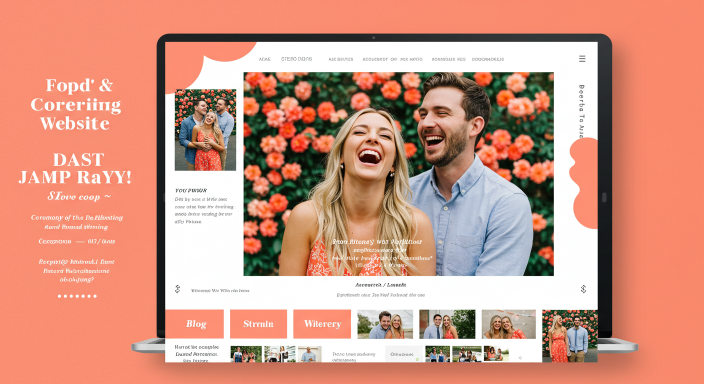
This is the most important step. Most modern wedding website builders, like The Knot, Zola, Joy, Squarespace, and Wix, use “responsive design.” This means their templates automatically adjust their layout, image sizes, and text to fit any screen size. You don’t need to be a coding expert; the platform does the heavy lifting for you. Before you commit, always preview your chosen template on your own phone.
2. Prioritize “Thumb-Friendly” Design
Think about how people hold their phones. Buttons and links should be large enough to tap easily with a thumb without accidentally hitting the wrong option.
- Size Matters: Ensure clickable elements like your navigation menu, RSVP button, and registry links are at least 44×44 pixels—the recommended minimum size for touch targets.
- Space It Out: Leave plenty of padding around buttons and text links to prevent mis-taps.
3. Simplify Your Navigation
A complex desktop-style menu with multiple dropdowns will be a nightmare on mobile. The best mobile sites use a simple “hamburger menu” (the three-line icon ☰) that expands to reveal a clean, vertical list of pages when tapped. This keeps the initial view clean and uncluttered.
4. Optimize Your Text for Small Screens
Long, dense paragraphs are difficult to read on a phone. Make your content scannable.
- Use Headings and Subheadings: Break up text with clear, bold headings (e.g., “The Ceremony,” “Travel Details”).
- Short Paragraphs: Keep paragraphs to 2-3 sentences.
- Bullet Points are Your Best Friend: Use bulleted lists for details like hotel information, travel options, and FAQ answers. They are infinitely easier to scan than blocks of text.
5. Compress and Scale Your Images
High-resolution photos are beautiful, but they can drastically slow down your site’s loading time on a cellular data connection. Use your website builder’s built-in image optimization tools, which typically compress images without a noticeable loss in quality. Also, avoid using images that are too wide; they should fit comfortably within a mobile screen without requiring horizontal scrolling.
6. Ruthlessly Test on Multiple Devices
Do not assume your site is perfect because it looks good on your own phone.
- The Scroll Test: Scroll through every page. Is the text readable without zooming? Do images load correctly?
- The Tap Test: Click every single link and button. Does the RSVP form work? Do the registry links take you to the right place?
- The Friend Test: Send the link to a few friends or family members with different phones (both iPhone and Android) and ask for their honest feedback. Can they easily find key information?
7. Think “Mobile-First” with Content
When writing your content, imagine someone quickly glancing at their phone. Put the most critical information at the top. For example, on your “Details” page, lead with the wedding date, time, and venue address before diving into the longer story of how you found the venue.
By embracing a mobile-first mindset, you move beyond simply having a website to having a powerful tool that genuinely serves your guests. It shows you value their time and comfort, making it easier for them to celebrate with you. A little effort toward optimization goes a long way in ensuring your digital welcome is as warm and organized as the celebration itself.


